You do not need an elaborate logo to make your small business recognizable. You need a clear idea of who you serve, a readable name and a handful of visual rules you can repeat across a sign, a label and a social post.
This guide follows fictional ALTO Coffee, a neighborhood café preparing its first takeaway packaging and launch announcements. The owner has limited time and budget. The goal is a coherent starting identity, not a complete agency-level brand system. The examples are hand-authored studies for learning, not generated client work or downloadable production assets.
Start with your positioning, before choosing a color
Write down who your business serves, what it helps them do and why they would choose it. Be specific enough that the answer changes a design choice. “Great coffee for everyone” is hard to act on. “A welcoming neighborhood stop for dependable coffee on an everyday budget” gives ALTO a useful boundary.
Turn that into a short working brief: ALTO should feel approachable, clear and warm. Its first applications are a takeaway cup, a small menu and a launch post. The name must remain readable at small sizes, the owner must be able to update prices, and the system should work in one color when printing is limited.
Separate facts from guesses. ALTO may know its opening hours and available packaging sizes while still guessing what customers find welcoming. Keep the audience assumption open until you have spoken to people. Decide who will approve the identity, what you can spend and which materials must be ready first. This keeps attractive experiments connected to a business need.
Gather references for a reason
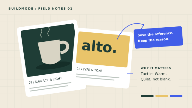
Collect a small set of references from several categories: a readable menu, a well-spaced wordmark, a packaging color combination and a photograph with the right mood. Record where each came from and what you noticed. “Clear price hierarchy” is more useful than “love this.”
For ALTO, matte ceramics suggest a tactile feeling, daylight suggests warmth and a simple café menu suggests an easy reading order. These observations can inform a direction without copying another business’s logo, illustration or distinctive packaging. References are starting points for reasoning, not a license to reproduce someone else’s work.
Group the references by the job they do. Keep mood separate from practical constraints: a beautiful pale label might fail on a dim shelf. Our guide to organizing design inspiration shows how to preserve the source and rationale so you can return to them when a choice is questioned.
Choose a small palette and one type family
Start with a dark text color, a light background and one optional accent. ALTO’s quiet route uses Forest, Oat and Sage. Forest carries text; Oat provides the surface; Sage adds a small decorative detail. Assigning roles prevents the palette from becoming a collection of interchangeable swatches.
Check actual foreground and background combinations for readability. A color that works as a large shape may be unsuitable for small text. Do not use color alone to communicate a price change, warning or selected option. Include words, borders or another visible cue. Print a sample too: screen color is only a preview of what paper, ink and lighting will produce.
Choose one type family with the weights and characters your business needs. Use a stronger weight for headings and a regular weight for descriptions. Test your longest product name, prices, punctuation and any languages you use. Avoid tiny text and overly tight spacing just to make everything fit; shorten the copy or simplify the layout first.
All studies below use the existing Geist family with different weights and layouts. They demonstrate how much can change without adding fonts. Before using any font in your own work, check its license for the intended use and keep a record of the source. Do not assume an attractive font found in a reference is available to reuse.
Make the business name do the work
A simple wordmark is the business name set deliberately in type. For ALTO, start with “alto.” in a medium weight, then inspect spacing, punctuation and readability. Keep a plain version that works without a background effect. Test it in black on white before relying on a special color treatment.
Give the name space around it. A practical starting rule is to keep nearby text and edges at least the height of the lowercase “a” away. This is a working rule to test, not a universal design standard. Avoid stretching the letters to fit a container or using several different wordmark treatments across channels.
Check for confusingly similar names and marks in your market before investing in signs or packaging. A visual study does not establish name availability or ownership. If the name is central to a costly launch, get appropriate professional help with clearance. You can make the first layout yourself while reserving specialist help for decisions with larger consequences.
Compare three possible identities for ALTO
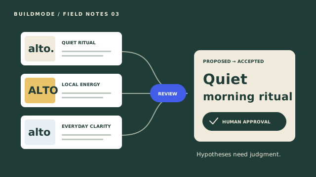
Keep the business brief constant and compare how each route expresses it. Quiet ritual favors calm and tactile warmth. Local energy emphasizes lively neighborhood communication. Everyday clarity prioritizes a system that is easy to maintain. Inspect the palette, type treatment and two applications before deciding which deserves further development.
One business. Three possible identities.
Compare hand-authored studies. Selecting a preview does not approve a Direction, commit Decisions or generate assets. Nothing is saved.
Quiet ritual
#1F3D36#F1EBDD#A3B0A1- Typography study
- Geist · medium headings, regular body. All previews use the existing Geist font; these are weight and layout studies, not custom typefaces.
- Tradeoff to test
- Restrained packaging may need a stronger sign to stand out on a busy street.
Takeaway label
Social announcement
The builder changes only the local preview. It does not declare a winning route or approve a BuildMode Direction. A human still needs to judge the tradeoffs, accept a Direction explicitly and commit specific Decisions separately. A sample application is a way to inspect a choice, not proof that it will work in production.
Write a mini style guide someone can follow
Capture the few rules you actually need on one page. Include the business promise, wordmark treatment, color names and values, approved text/background pairings, type family and weights, and two example layouts. Add a short voice note such as “plain, warm language; clear prices; no exaggerated claims.”
For ALTO’s quiet route, the guide could say: Forest text on Oat, Sage only for decoration, one family with medium headings and regular body copy, warm natural photography, and generous space around the name. Include a monochrome example and the smallest size you have tested. Label untested sizes and materials as unresolved.
Record a version date and where the working files live. Keep editable source files separate from exports intended for a printer or social platform. Confirm dimensions, bleed, color setup and file format with the actual supplier before sending production work. A screenshot of a mockup is not a print-ready file.
When the work grows, turn the moodboard into a project plan: link accepted choices to requirements, deliverables and open questions. A useful style guide is small enough to follow and explicit enough that another person can apply it consistently.
Test where customers will encounter the brand
Make inexpensive samples before ordering a batch. Print a menu at actual size, wrap a paper label around a cup and open a social post on a phone. View them in the lighting and at the distance where they will be used. Check whether the name, product and price are clear without explaining the design.
Ask a few intended customers practical questions: “What kind of place do you think this is?”, “Where would you look for the price?” and “Can you read the name from here?” Avoid asking only whether they like the color. Preference can be useful, but a failure to read the menu is a more concrete problem to fix.
Change one thing at a time and record why. If the wordmark disappears at cup size, adjust size or spacing before replacing the whole identity. If the menu feels crowded, simplify hierarchy. Set a review point after launch so the first version can improve without a different visual style appearing every week.
For the broader workflow, read why ideas get stuck between inspiration and execution and how to keep intent connected to work.
Use AI to examine choices, with human judgment
AI can help draft a brief, propose alternative interpretations of reference notes or suggest questions to test. Supply the business context, constraints and observations, then ask it to explain assumptions and tradeoffs. Treat confident wording as a suggestion to inspect, not evidence of what your customers want.
Do not upload confidential customer information or material you lack permission to share. Check claims, spelling and any suggested references yourself. Do not assume an AI image or mark is unique, cleared for commercial use or technically ready for production. The studies on this page are fixed illustrative examples, not an automatic logo generator.
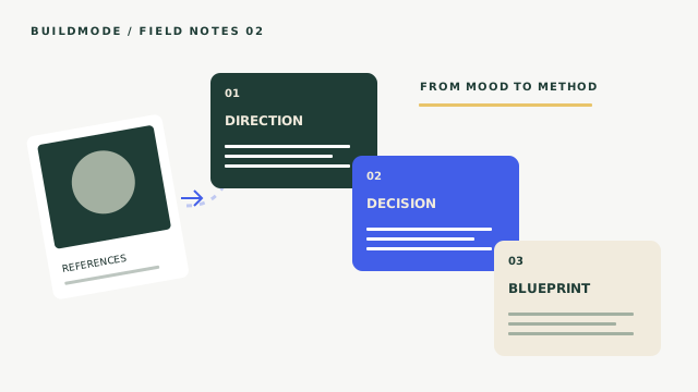
BuildMode’s workflow connects references and rationale to proposed Directions and explicit human approval. Accepting a Direction does not automatically commit Decisions. Creative Blueprint and execution planning are in refinement during private beta; future asset-generation concepts and planned integrations are separate capabilities. This guide does not promise automatic logo creation or a complete generated brand system.
Read how AI can help explore creative Directions for a simulation of hypotheses, source evidence and separate acceptance. For your own business, the useful next step is smaller: write the brief, choose one route to test and make a readable sample in the place it will actually be used.